|
|
Post by X-Fan on Mar 2, 2009 8:14:33 GMT -5
Post your reviews of the Coming of Apocalypse 4-Pack from Wolverine 4-packs here.
|
|
|
|
Post by easyecvn76 on Mar 2, 2009 16:33:39 GMT -5
Except for the fact that half the figures are almost completely figures from before. Archangel and an Apocalypse without a retarded grin are great.
|
|
|
|
Post by mattthompson on Mar 6, 2009 12:36:25 GMT -5
In agreement. I really wish Hasbro had wowed me. They finally release a tons of characters I've wanted to see for some time, and the bulk of them are repaints or retooled. With the exceptions of Blob, and Apocalypse these sets are almost completely a bust. Hasbro wants my money, well I want a hooded Archangel with wings that don't make him look like a wuss.
|
|
jestergoblin
Autobot
 [glow=black,2,150]THE DARK LORD[/glow]
www.jestergoblin.com
[glow=black,2,150]THE DARK LORD[/glow]
www.jestergoblin.com
Posts: 3,047
|
Post by jestergoblin on Mar 6, 2009 18:23:53 GMT -5
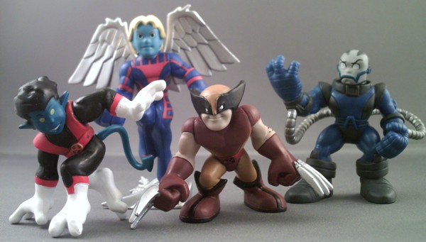
For the last Nightcrawler I said "An excellent figure. His somewhat awkward stance works very well for Kurt. I wish his tail rotated. But a fantastic figure overall. A-" I stand by this, his tail is slightly different and his buckle is gold instead of yellow. Great figure still. A-
I first reviewed Wolverine as "Wolverine looks smug. He also looks like he got thrown into a wall. He's neckless! On his own, he's nothing exciting. The other brown suit version is better but where this one excels is that he can do the fastball special! B (but only when with Colossus from this set)" This version doesn't get the benefit of Colossus but gains arm hair and an X painted on his belt. Not a worthwhile change, C-
Archangel is a repaint, so my first review was "Angel works very well for displaying his power. By standing about a half inch taller, he looks over other figures. His wings do look a little odd though, they appear more like Archangel's metal wings than Warren's feather wings. Still, even with sharing arms with Magneto, this figure looks unique and different. Solid figure over all. B" I love how this figure came out, my only complaints are he isn't wearing the skullcap and you see the line details from the old suit, but great figure. A-
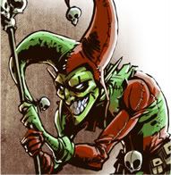
Finally the new figure: Apocalypse! Apocalypse has always been one of my favorite characters. He's sporting 3 POA: arms and neck. His tubes limit the arm articulation. I'm not sure how I feel about the white eyes, I'd prefer the black-red eyes. He's big and nicely imposing, about a half inch taller than most figures. Great figure but not excellent. A-
This pack is nice, I love that they at least packed Apocalypse with Archangel. It could have made an excellent 2-pack. The set's backdrop is some wreckage with the Blackbird in the background. It looks good. Overall, I like the pack. I'm a huge fan of Apocalypse and I'm glad we don't have the jolly fat version only anymore.
|
|
|
|
Post by gambit293 on Mar 30, 2009 21:44:58 GMT -5
If Wolverine with hairs painted on his arms equals repaint-, then Angel repainted as Archangel equals repaint+. To me, this repaint is almost good enough to constitute a new figure. But they definitely could have done more. I would've preferred hooded archangel. The wings look too sharp to be soft feathers and yet too scruffy to be metal. It makes me wonder if this repaint was the plan all along. This is a good pose for any flyer, but it suits Angel better than Archangel. It's a pose showing off the majesty of flight, and looks a little too subdued for the rage and sharpness of Archangel. B+
I've decided to keep Nightcrawler even though it's almost identical and I normally get rid of dupes. Kurt is my favorite Marvel character so I might as well have two. I wouldn't have noticed the different tail curl if Jester hadn't noted it. I like the original figure a lot, but the lameness of the repaint is dissappointing. The choice of Nightcrawler in an Apocalypse themed pack also seems a bit arbitrary. B
Wolverine has hairs painted on his arms. Nearly every color on his body is a notch darker on this version compared to the Showdown with Magneto pack. It's especially noticeable on his skin. Even if I liked this darker paint (which I don't), I'd still ditch this figure because mine has a lousy paint job. As a lousy repaint of a fairly decent original figure, I give it: C+
I'm very happy to have Apocalypse since I skipped the mega pack. I like that they included the hoses connecting his arms to his back but they somewhat inhibit his arm movement and I worry that they'll wear down and fall off one day. It's true that Apocalypse is a smidge taller than your average SHS figure but he lacks presence. I think this rendition is a bit too gangly and not hulking enough. Apocalypse's upper body should be exaggerated more. The best example I can give of what I have in mind is the Ironman Hulkbuster, which is a fairly wide figure. B+
|
|
|
|
Post by bert19 on Apr 4, 2009 5:46:03 GMT -5
Got this set two days ago. Overall, a little bit dissappointing if i'm honest.
Apocalypse is great, but the other three figures aren't really anything special.
Oh, how i'd love to get a proper Archangel....
|
|
|
|
Post by arbcotoys on Apr 7, 2009 21:15:03 GMT -5
Archangel looks pretty cool and I do wish Apocalypse was just a bit bigger. Otherwise a decent set.
|
|
jestergoblin
Autobot
[glow=black,2,150]THE DARK LORD[/glow]
www.jestergoblin.com
Posts: 3,047
|
Post by jestergoblin on Sept 23, 2010 8:01:42 GMT -5
 My three favorite X-Men bad guys all have one thing in common: being blue. Of course, blue seems to be the predominate color for the X-Men in general. I don’t know why, but I’ve always loved the pairing of Apocalypse, Mr. Sinister and Mystique facing off against the X-Men. But the biggest issue for me was the fact that the original version of Apocalypse released in the Super Hero Squad was too big and way too jolly. Follow the coming of Apocalypse: jestergoblin.com/?p=5265 |
|
|
|
Post by the7thcynic on Sept 23, 2010 8:04:30 GMT -5
Too jolly? BOOOOOOOOOOOOOOOOOOO!
|
|